


The University of Iowa is a place that is near and dear to my heart. I also happen to have strong feelings about their uniforms. I’m not sure why, but I’m pretty sure it started after I followed Paul Lukas on Twitter. So let’s just dive into this thing faster than an Iowa run play on 3rd and 9 and talk about the most impactful Iowa football uniforms of my lifetime.

Wings
I give partial credit to Hayden Fry’s mad genius for my obsession with athletic uniforms, shoes, and equipment. Heck, he may have even jump started my appreciation for all things fashion (but I think it’s mostly from my fashionista mother). I can remember clearly seeing the winged jersey’s of the Hawkeyes taking flight for the first time on a crisp, fall afternoon. It was also the first time that I was able to put together the “in your face” symbolism that is now common place on college uniforms. These were the Hawkeyes…and Hawks have wings. Now, I understand the logic doesn’t hold up perfectly (what exactly is a Hawkeye?) but let me just roll with it for this article. THEY’VE RUINED EVERYTHING ELSE THAT I HOLD SACRED…SO JUST LET ME HAVE THIS NOSTALGIC MOMENT!
These uniforms were the essence of cool. They are a great microcosm of Hayden Fry’s legacy at the University of Iowa. They were trendsetting and way ahead of their time. I would argue that they started the uniform “arms race” that we have today, where symbolism, visual appeal, and “coolness” are just as important as function. And just like Hayden Fry, they put Iowa on the map with some “razzle dazzle,” but were never able to bring home any meaningful championships for the Hawkeyes (oooh burn).

“Classics”
The Kirk Ferentz era at the University of Iowa has been one of consistent, hard nosed, and old school football. Ferentz’s “pound the rock” mentality works perfectly for a school that is never going to be able to compete with the SEC or top tier Big 10 teams in recruiting. It’s what has allowed Iowa to have some great years on the national stage of college football. One thing this attitude doesn’t elevate are Iowa’s unbelievably boring (and terrible) current uniforms. They can’t be “classic” if they’ve always sucked, people. For the sake of not “piling on” let’s just stick with the current road uniforms.
Let me tell you a quick story:
In 1979, Hayden Fry helped to create the Tiger Hawk, the logo seen on Iowa’s football helmets. Since both teams shared the colors of black and yellow gold, Fry sought and gained permission from the Pittsburgh Steelers, the dominant National Football League (NFL) team of the 1970s, to overhaul Iowa’s uniforms in the Steelers’ image. Fry’s idea was that if the team were going to act like winners, they first needed to dress like winners. (Wikipedia)
That is literally where the story ends. Iowa is still wearing uniforms from the 1970’s. I can’t put it any better than that. It pains me every single Saturday to see the potential of a great color scheme and a perfect logo go to waste. Maybe Ferentz could start to compete on the recruiting trail a little more if he let the wizards at Nike work a little magic on those uniforms. Hell, at least pull out the “winged” jerseys once a year at this point! Those 90’s throwbacks are literally more progressive than the 1970’s relics they wear every weekend. Yeah…let that soak in for a second… Did I just mess with the space-time continuum or something?
So, I said I wasn’t going to pile on…but let’s keep going. Now, as I stated above, the Iowa Hawkeye logo is legendary. It’s one of the most recognizable symbols in the country(!) and looks damn cool. You would think that they could just slap this logo onto a black helmet and at least salvage some style points. WRONG! They can’t even get that right with this uniform combo. Iowa’s helmets have more flair on them than a TGI Friday’s waiter.

I know I’m stepping into some sacred ground here, but this is a blog article about fashion, it ain’t the New York Times. Those ANF (America Needs Farmers) stickers have got to go. Yes, I am in favor of America’s farmers (we do need them), but do they really need that sticker…off center…on only one side…right…there?

It’s just one of the things that doesn’t make any visual sense on Iowa’s helmets. The other is the size of the numbers on the back of their helmets (see photo above). Are they only recruiting descendants of Mr. Magoo? Does the entire coaching staff need Lasik surgery? Listen, I completely understand tradition and paying your respects, but there has GOT to be a better way to organize all of it on a helmet. What could have potentially been a great looking piece of equipment has been relegated to looking like my 4 year old niece’s sticker chart. Whew…glad I didn’t pile on.

Blackout
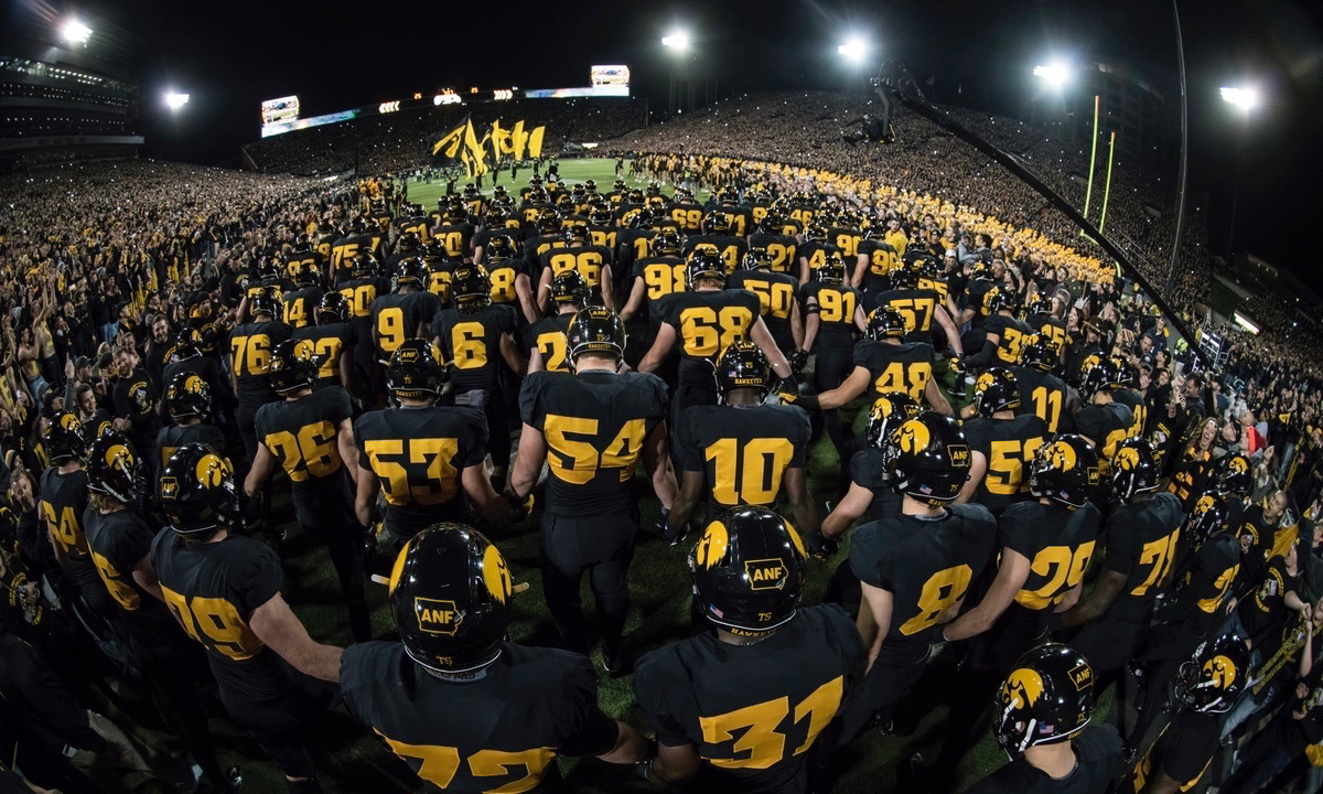
This brings me to the third uniform that I want to discuss. The 2015 Blackout uniforms that Iowa wore against Minnesota. I never thought I would see the day, but finally…we were cool! When Iowa ran out of the tunnel wearing those perfectly black uniforms, I couldn’t believe my eyes. We actually did something that rivaled the likes of Oregon, Navy, UCLA, and the other trendsetters of college football. When I saw those, it completely amped me up. I was so excited that I immediately took down a Jaeger Bomb, ordered a Coors Light, and told the hard 6 next to me that she could order any domestic draft beer she wanted. I can only imagine what it did for the players. These were the perfect example of Iowa’s uniform potential. Listen, I can handle “tradition” and the workman like attitude of the current Iowa program, but would it really hurt for Iowa to step up their uniform game just a little bit? Can’t I get a souped-up, Phil Knight approved, Nike designer’s wet dream of a uniform for three games a year? One big home game, one big road game, and the Blackout game is all it would take to keep me happy. I usually don’t remember more than three games a year anyways.
This whole story could have just been one entire homage to Hayden Fry. Pretty much everything mentioned in this article has some origin in Hayden Fry lore. The man’s influence over the entire football program is still seen everywhere, including all of the referenced uniforms. He created the Tiger Hawk AND it spells his name for crying out loud (for the record I still don’t see it)! He was so far ahead of his time it was crazy and I think he is still under-appreciated everywhere outside the state of Iowa. The uniforms I referenced have had a huge impact on me, for better or for worse. With that being said, I honestly believe it’s time for Iowa to evolve aesthetically. I’d love to see some new looks (they proved it can be done) that have an impact on me for the next 40 years. I can guarantee it’s what Hayden Fry would be doing. Go Hawks!
Do you agree or disagree with my opinions? Let me know in the comments section below.